
Routine Vitamins
Designing a distinctive, everyday supplement brand with high visual impact and clarity.
project info
Routine Vitamins required a brand identity and packaging system that stands out in a crowded supplement market while remaining clear, accessible, and trustworthy. The result is a confident visual language with strong colour, typography, and a recognisable product presence.
services
Brand Strategy
Visual Identity
Packaging Design
Label System
YEAR
2021
Client
Routine Srl
Industry
Supplements & Wellness

The brief
Routine Vitamins aimed to position itself as a modern, accessible supplement brand — designed for everyday use while maintaining credibility and clarity. The challenge was to create a brand that stands out on shelf and in digital environments, without losing the trust and structure expected within the category. The opportunity was to build a system that combines bold visual expression with clear communication — making the product both noticeable and easy to understand.
what we did
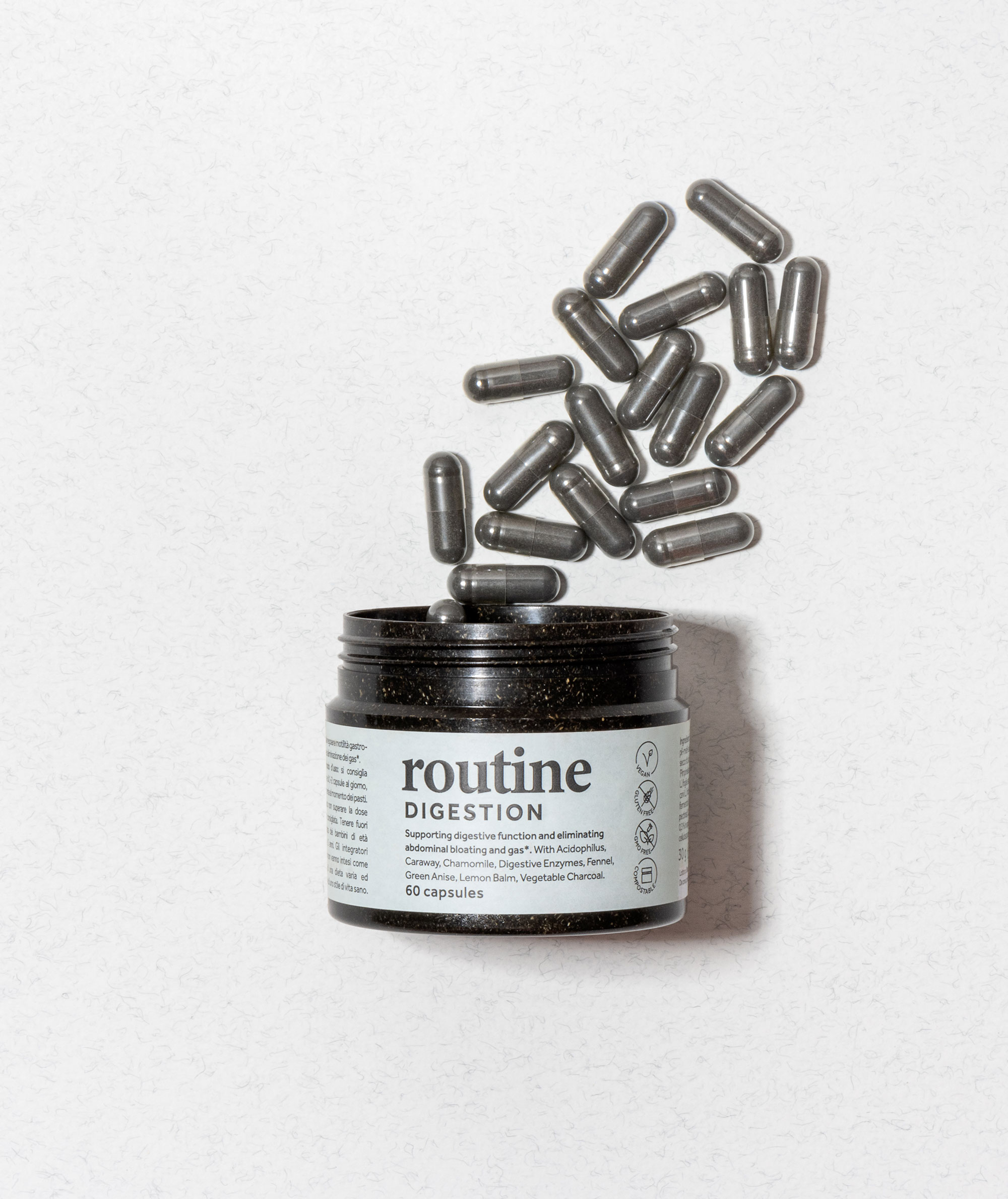
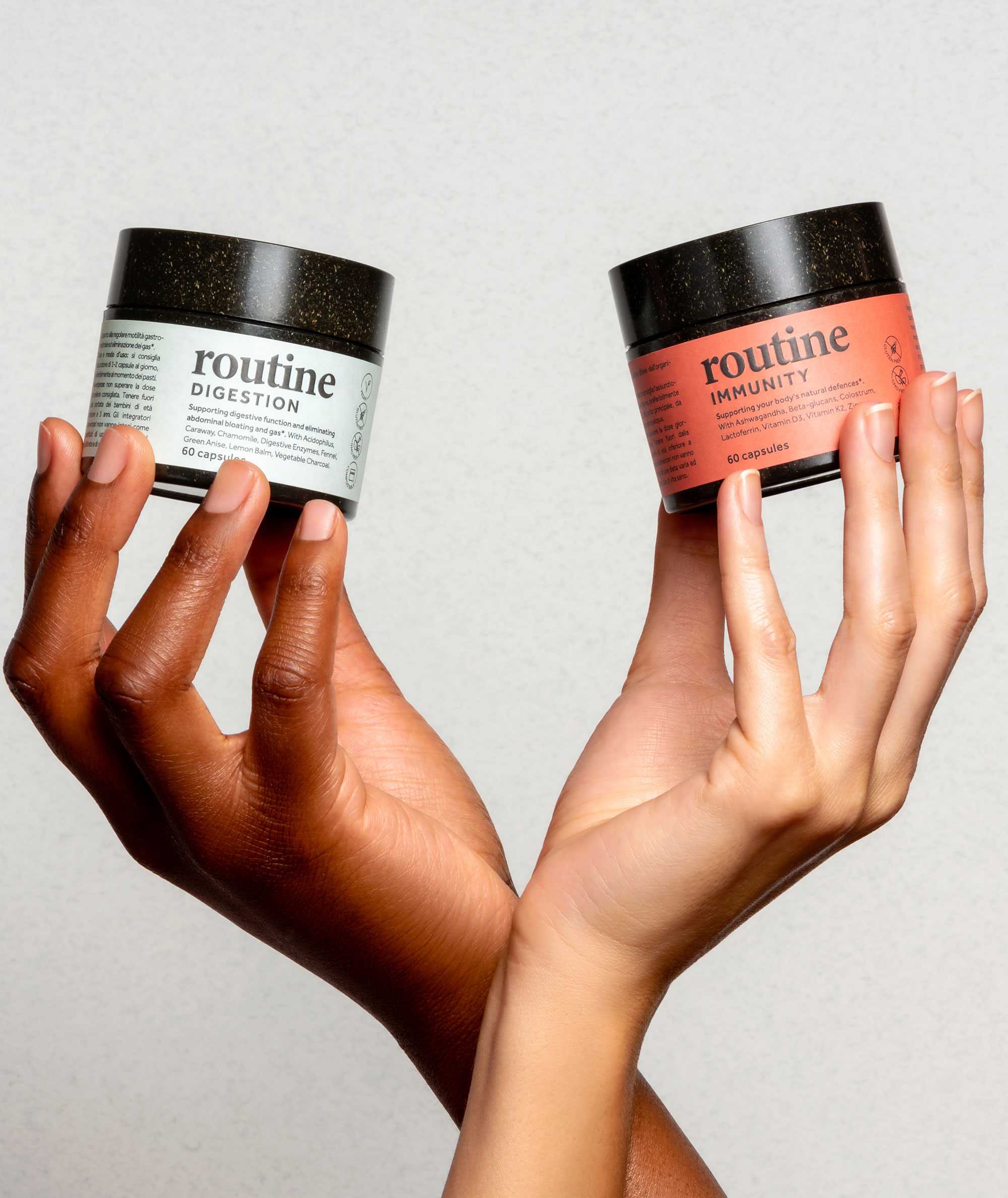
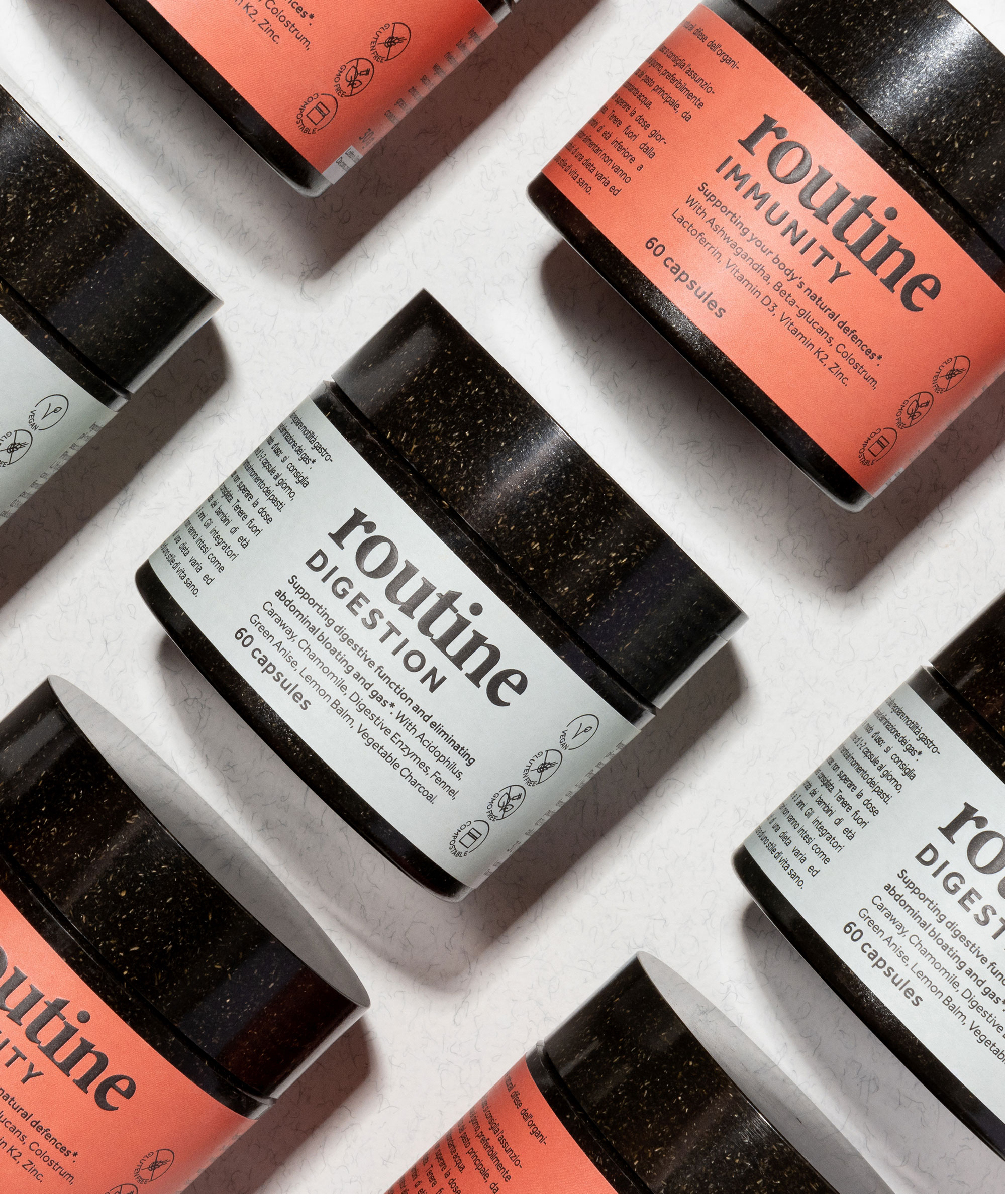
We developed a brand identity and packaging system designed for visibility, clarity, and scalability. The identity uses strong colour and typographic contrast to create immediate recognition. The packaging system is structured for consistency across variants, allowing flexibility while maintaining a unified appearance. Art direction and imagery extend the brand into a tactile and human context — reinforcing accessibility and product relevance.


We developed a brand identity and packaging system designed for visibility, clarity, and scalability. The identity uses strong colour and typographic contrast to create immediate recognition. The packaging system is structured for consistency across variants, allowing flexibility while maintaining a unified appearance. Art direction and imagery extend the brand into a tactile and human context — reinforcing accessibility and product relevance.